Charity Intake Form Redesign
UX Analysis & Redesign of the Patient Advocate Foundation’s website
Duration
12 weeks
Tools
Figma, Zoom, pen and paper
Overview
The Project
I led this unsolicited redesign of the Patient Advocate Foundation’s (PAF) case management intake form.
My role as a UX designer involved research, analysis, design, prototyping and user testing.
The project took place for 12 weeks as part of a bootcamp programme with the Interaction Design Foundation.
The Organisation
Patient Advocate Foundation (PAF) is a US-based non-profit organisation that helps chronically ill patients access free financial and legal support. The bulk of PAF users are patients who are newly diagnosed with chronic and life-threatening illnesses (typically cancer).
Besides facing a new life-changing diagnosis, American patients are responsible for paying all health insurance premiums and treatment co-pays. This financial burden only adds to the stress of a serious illness.
Discovery
The Problem - Navigation & Accessibility
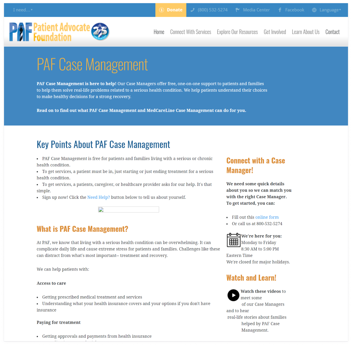
As an organisation, PAF offers an invaluable service to its users. However, their current website is difficult to navigate and violates multiple accessibility guidelines.
Nowhere are these problems more evident than on the case management intake form.
This form is also where most new users are directed; for many, it’s the first way they experience PAF. However, it is so difficult to use that it has its own 13-page user guide (external link).
The last thing a patient needs is to face a lengthy and confusing intake form when they are stressed and in urgent need of help. However, several interviewees mentioned that these confusing designs are all too familiar in healthcare interfaces.
Nowhere are these problems more evident than on the case management intake form. This form is also where most new users are directed; for many, it’s the first way they experience PAF. However, it is so difficult to use that it has its own 13-page user guide (external link).
The last thing a patient needs is to face a lengthy and confusing intake form when they are stressed and in urgent need of help. However, several interviewees mentioned that these confusing designs are all too familiar in healthcare interfaces.
Constraints
The most significant constraint was having no direct access to PAF’s users. I am in the UK, and travel restrictions limited my ability to travel to the US.
However, I am used to working within strict constraints in my current role, so I wasn’t going to let that one problem deter me. I figured that an organisation of PAF’s standing would likely have already done substantial client research, and it was simply up to me to find it.
Research
Designing With Data: PAF’s Annual Impact Reports
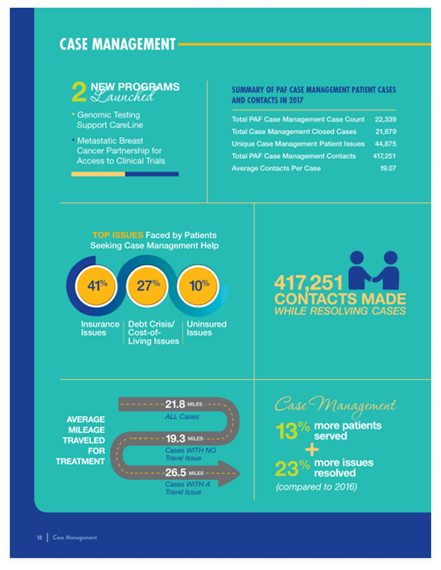
After digging through PAF’s site, I found their annual impact reports.
-
Patient demographics
-
Case counts for PAF's main divisions
-
Direct patient interview quotes
These documents sum up the key themes and trends amongst PAF’s primary users groups, and include:
Jackpot! Since I wouldn’t have direct access to PAF’s user base, I took full advantage of incorporating this existing research into my study.
I compiled five years of data from these reports (from 2016 to 2020) to help ensure that my design choices were based on actual data and not clouded by my personal biases. I referred back to this data throughout the design process.
What I Learned From the Impact Report Data
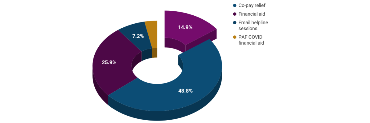
At first glance, Case Management only makes up 15% of PAF’s service offering.
However, I noticed multiple calls-to-action direct users to the case management intake form on PAF’s site.
As I continued to explore the site, I realised that the intake form funnels users toward all other PAF services, including financial aid and co-pay relief.
In fact, over 89% of users do interact with PAF’s case management services, even if only via the intake form. I decided I would focus on evaluating and redesigning the intake form, but I knew this was still too broad of a problem to solve.
This Process Produced Two Hypotheses:
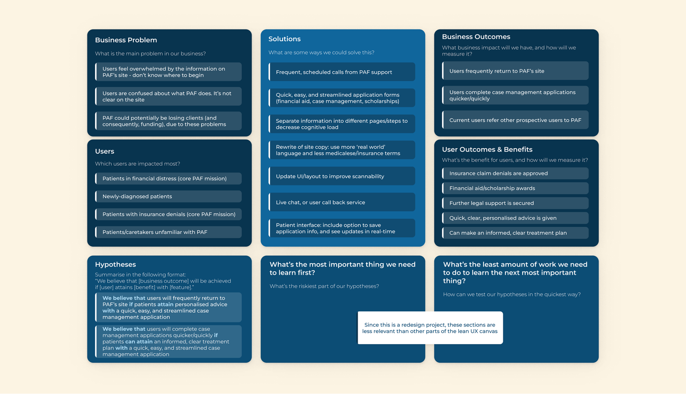
We believe that users will trust/visit PAF’s site as a first port of call if patients can attain personalised advice with a quick, easy, and streamlined case management application.
We believe that users will complete case management applications quicker/quickly if patients can attain an informed, clear treatment plan with a quick, easy, and streamlined case management application.
I decided to focus on Hypothesis 2 because measuring confidence would be difficult without access to PAF’s client group. With this more quantifiable hypothesis as a north star, I finally felt comfortable moving to the project’s next phase.
Define
Personas
Currently, PAF’s site tries to serve patients, medical professionals, and caseworkers. Unfortunately, keeping the scope so broad only risks further user confusion. I knew that, in this case, personas would help me target a more specific user group. But I didn’t want to guess or make assumptions about PAF’s user base.
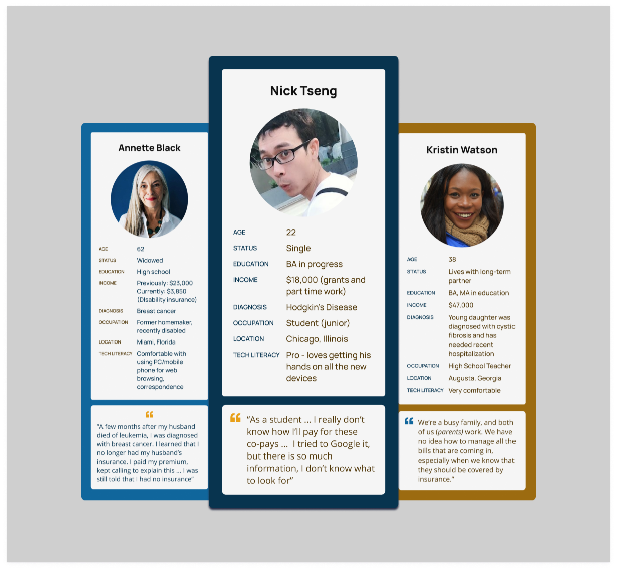
Once again, PAF’s yearly impact reports saved the day. I used the data I previously compiled to create these three personas. Two represented standard PAF users, and one (Nick) described the ‘extreme’ user.
Ideation
Best and Worst Possible Ideas – Crazy Eights
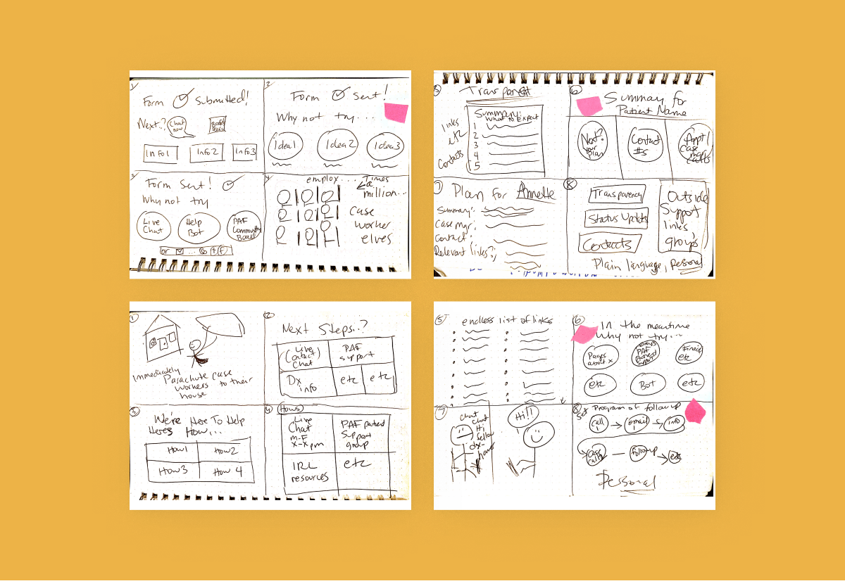
This is just a selection of the Crazy Eights I sketched as I focused on the case management intake form & follow-up screen features. I made sure to consider some of the worst possible solutions, as this process helps me work through any ideation blocks.
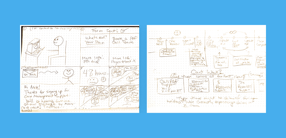
Sketching What Occurs Away From the Screen
PAF’s digital presence is only a portion of its service offering; I wanted to ensure I considered what occurs before and after the user interacts with the website. Sketching the end-to-end experience helped me imagine this journey.
These sketches naturally progressed from the Crazy Eight panels that I flagged up with the pink notes. I started wondering about the time between each interaction and how we might help users feel supported even when waiting for a response.
Prototype
From Sketches to Wireframes
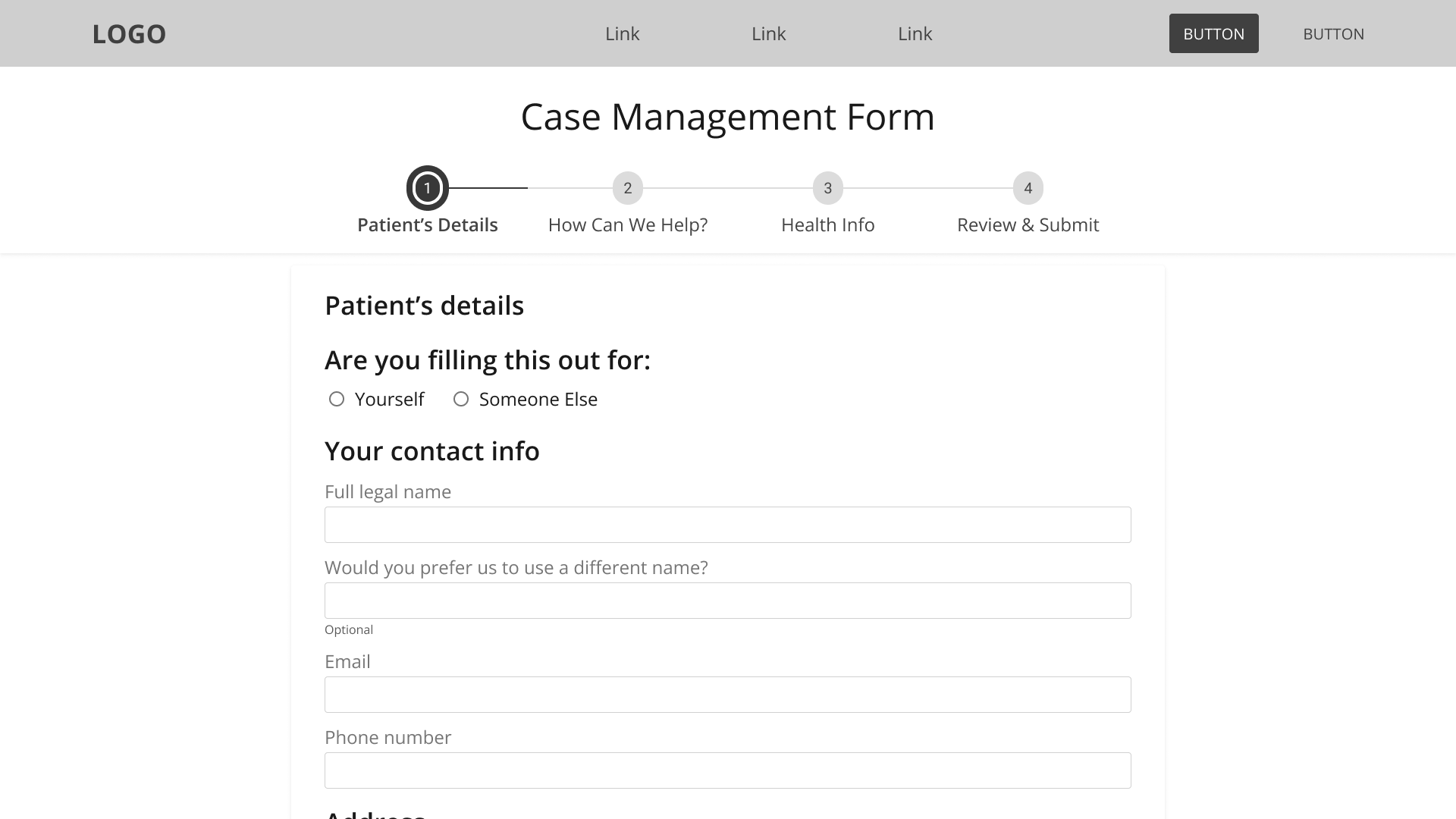
It was essential to build wireframes so I could complete the usability testing. Testing with real, live humans was the main objective because I needed to compare task times to test my hypothesis. So it was more important for me to do a rough, ready and scalable wireframe rather than focus on a flashy, polished product.
Design Rationale
Even though I wasn’t concerned with creating pixel-perfect screens at this stage, I wanted to ensure that my design focused on reducing the stress of a new diagnosis or prognosis. I designed screens with minimal options and plenty of white space to provide breathing space for users.
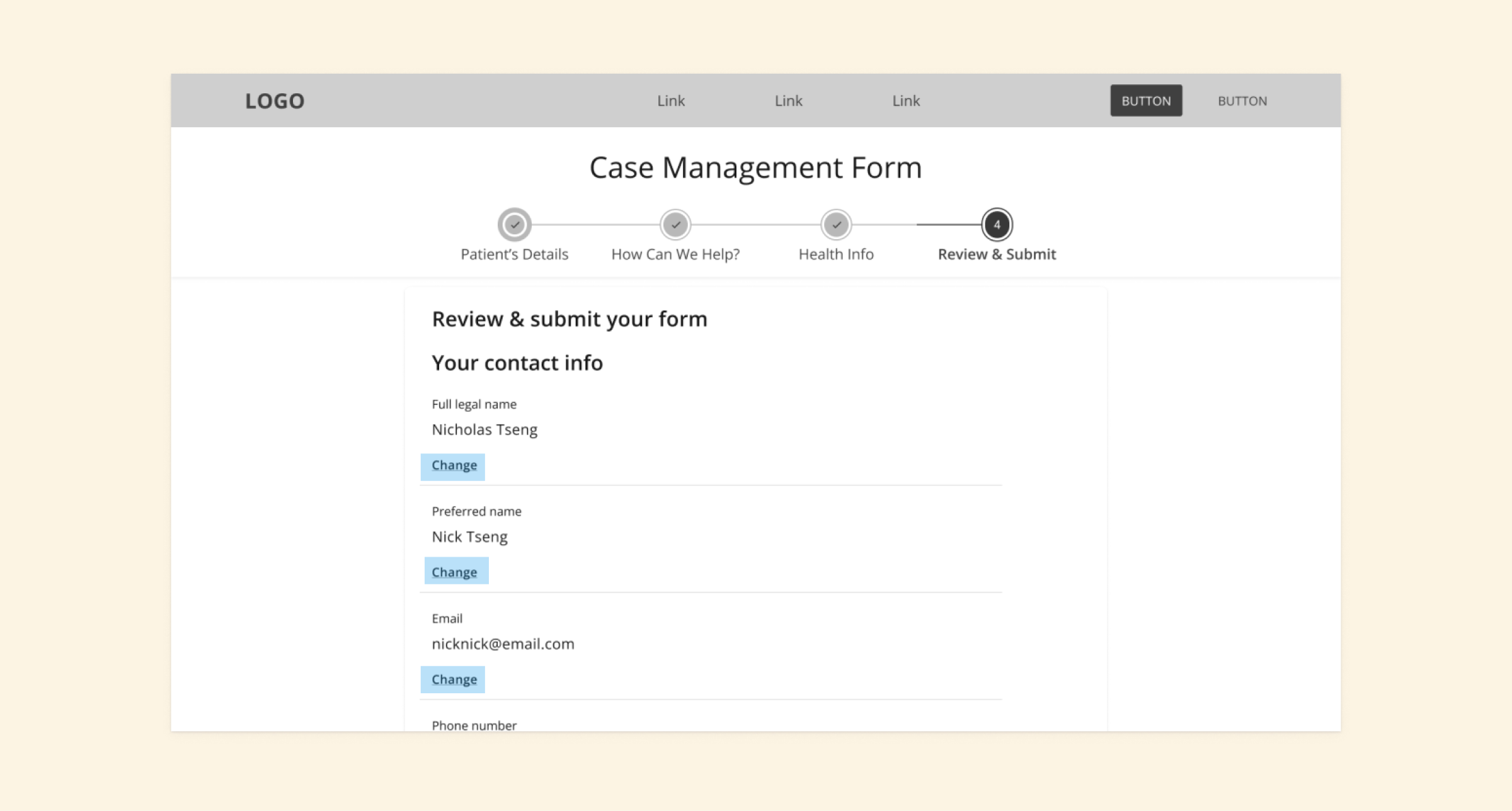
GOV.UK’s thorough design guidelines influenced my choice to ask about legal vs chosen names and sex rather than gender. Inclusivity and accessibility are also essential considerations in my design process. I understand that health organisations need to know legal names and birth genders for insurance reasons, but this should not come at the expense of any user’s experience.
I based the review screens on GOV. UK’s ‘Check Answers’ design pattern. Initially, I had reservations about including this “Change” link between each section of the review page and worried it might be too repetitive. However, a GOV.UK Github discussion stated that this pattern was intended to provide better accessibility for screen reader software, so I was more than happy to keep it.
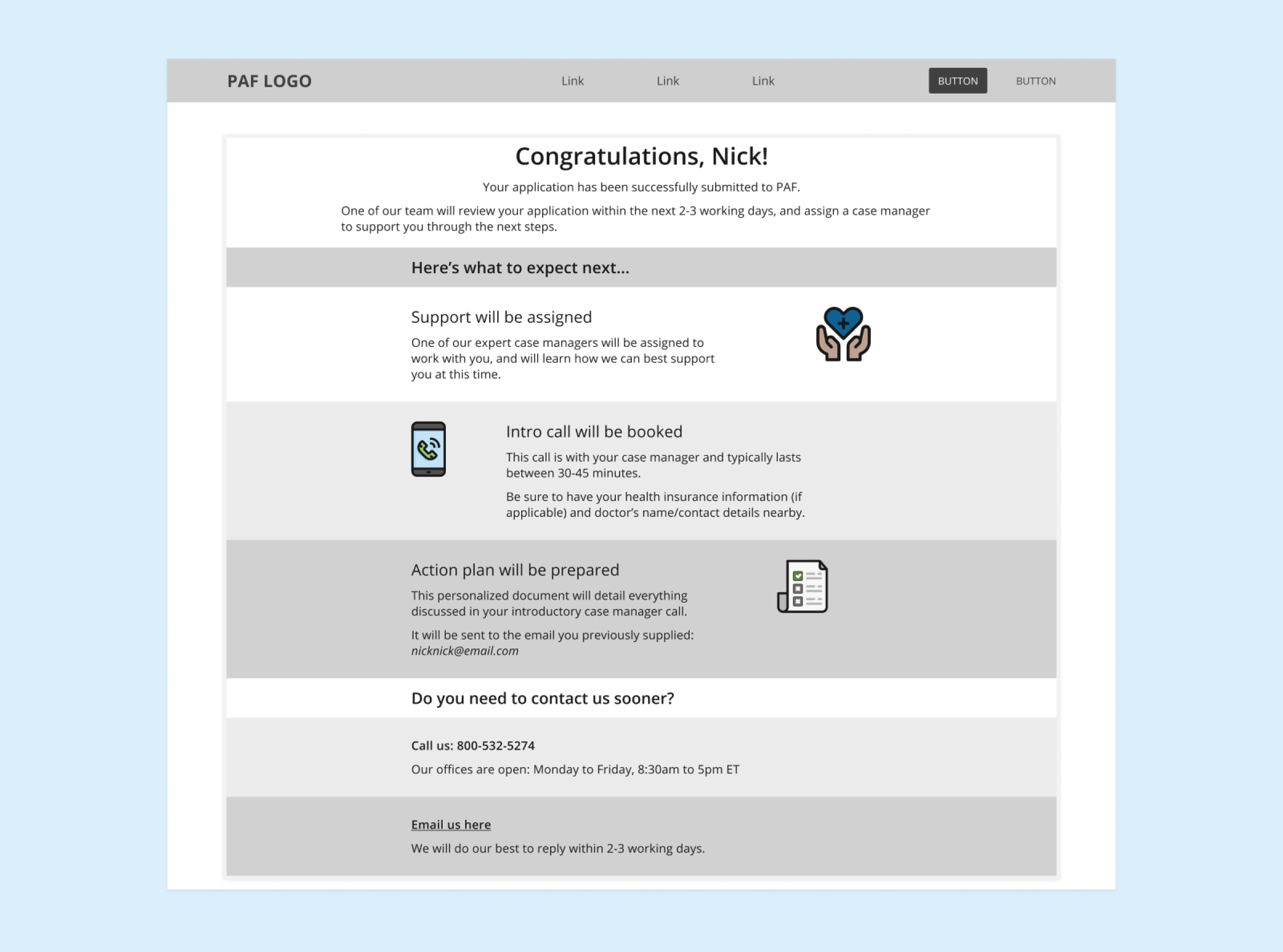
A Code For America case study inspired this confirmation page design; I especially liked how clearly it outlined the next steps of the service and hoped that this would minimise some of the stress a user might feel.
Testing
User Testing
I wanted to understand if I was on the right track with my prototype, so I began testing after creating the wireframes. All the steps (from hypothesis to here) led to this point.
I tested the prototype with five individuals after completing some pre-screening to ensure that they were:
-
US-Based
-
Over 18 years old
-
Experienced in the US healthcare system
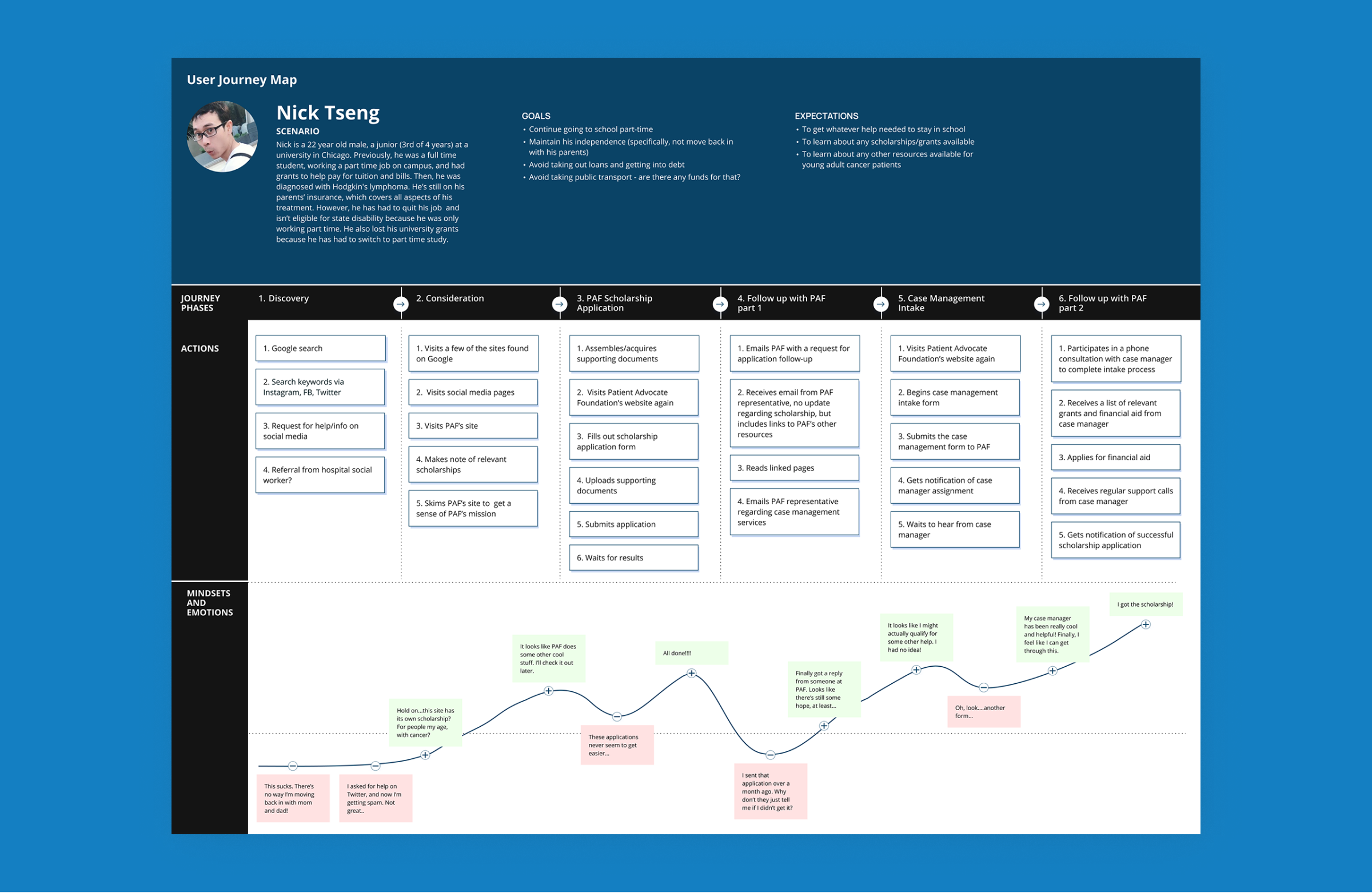
We did remote testing via Zoom, utilising the scenario provided for Nick’s persona. My key metric was to learn which version of the form was quicker to complete.
Testing Results
Results concluded that by applying established usability guidelines and creating interactions that users were expecting, I could improve the time to completion by 108%.
108%
improvement in time needed to complete the intake form
Opportunities for Improvement
In a perfect world, I’d follow this up by conducting additional user testing with a more extensive group of PAF’s users. I might also apply a similar redesign process to other sections of PAF’s site.
However, this study showed me that even with strict limitations, plenty can be done (including utilising existing research and usability guidelines) to improve the user experience of a site.
I think one of the testing participants said it best:
