Rapid Broadcast Redesign
How I Redesigned 50+ Broadcast Graphics in 48 Hours With No Handover or Access to Software
Project Duration
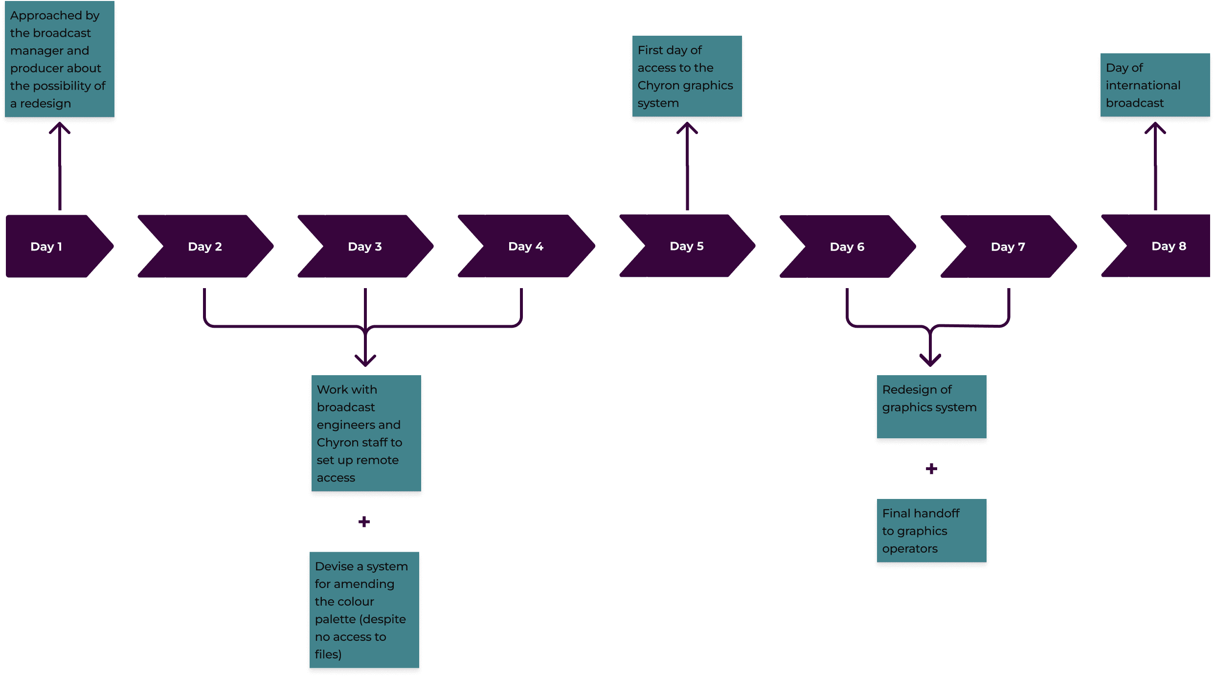
8 days (from initial brief)
Tools
Figma, Adobe Photoshop, Chyron
Team
Myself, live broadcast producer, live graphics operators broadcast engineers
Overview
Applying UX design principles to a high-pressure broadcast design project in a remote setting, or...
How I Updated:
50+ motion graphics templates
With only 2½ days of access to the necessary software
No handover
The Client
I have anonymised the client details due to a confidentiality agreement.
But what I can say about the event is that it has:
A worldwide audience
with an estimated
1 billion viewers
No pressure, then!
My Role
I did the work remotely from my living room, with the help of post-disco music and lots of coffee. Given the above-mentioned constraints, I had to make many rapid decisions independently.
However, I worked in collaboration with:
-
On-the-day broadcast producer
To confirm design choices (efficiently and concisely)
-
Production Graphics Operators
-
Multiple broadcast engineers and IT support staff
For remote set-up and post-event handover
I know it was nowhere near as easy as it sounded when I first pitched it, but the end result was well worth it."
Discovery
The Problem
A work colleague approached me about the possibility of working on a high-profile event broadcasting to over 100 countries worldwide. My company’s client wanted to refresh the broadcast graphics to commemorate a special anniversary event.
Only thing was, there were two problems:
I had no access to the requisite Chyron software or graphics database
(I was shielding at home due to the pandemic)
I received this brief only a week before the actual broadcast
For context, these types of projects typically take 4-6 weeks of full-time work.
However, after a year of isolation, I was determined to keep these (not so) minor details from getting in my way.
Constraints
Time!
In addition to receiving the brief so late, getting set up with remote Chyron access took several days, leaving me only approximately two days to complete the project.
Additional Constraints
While remote work has its benefits, I found that it isn’t ideal for the collaborative and fast-paced world of broadcasting.
I didn’t have the requisite software on my computer, and there wasn’t enough time to get a proper Chyron machine to my home.
Since time was so limited, this left me remoting into old Chyron devices. Unfortunately, these would freeze up, which then impacted into the time constraint.
I had to rely on experience and guesswork to find the original graphic templates. Also, figuring out the original designer’s process without handover was an additional challenge.
Define
Primary Users
…no biggie!
We were distributing our work to the primary contracted client and outside broadcasters
And any staff members that needed to operate any graphics that I updated or redesigned
At first, the global broadcasters appeared to be the most critical users. But after some reflection, I realised the key user was closer to home.
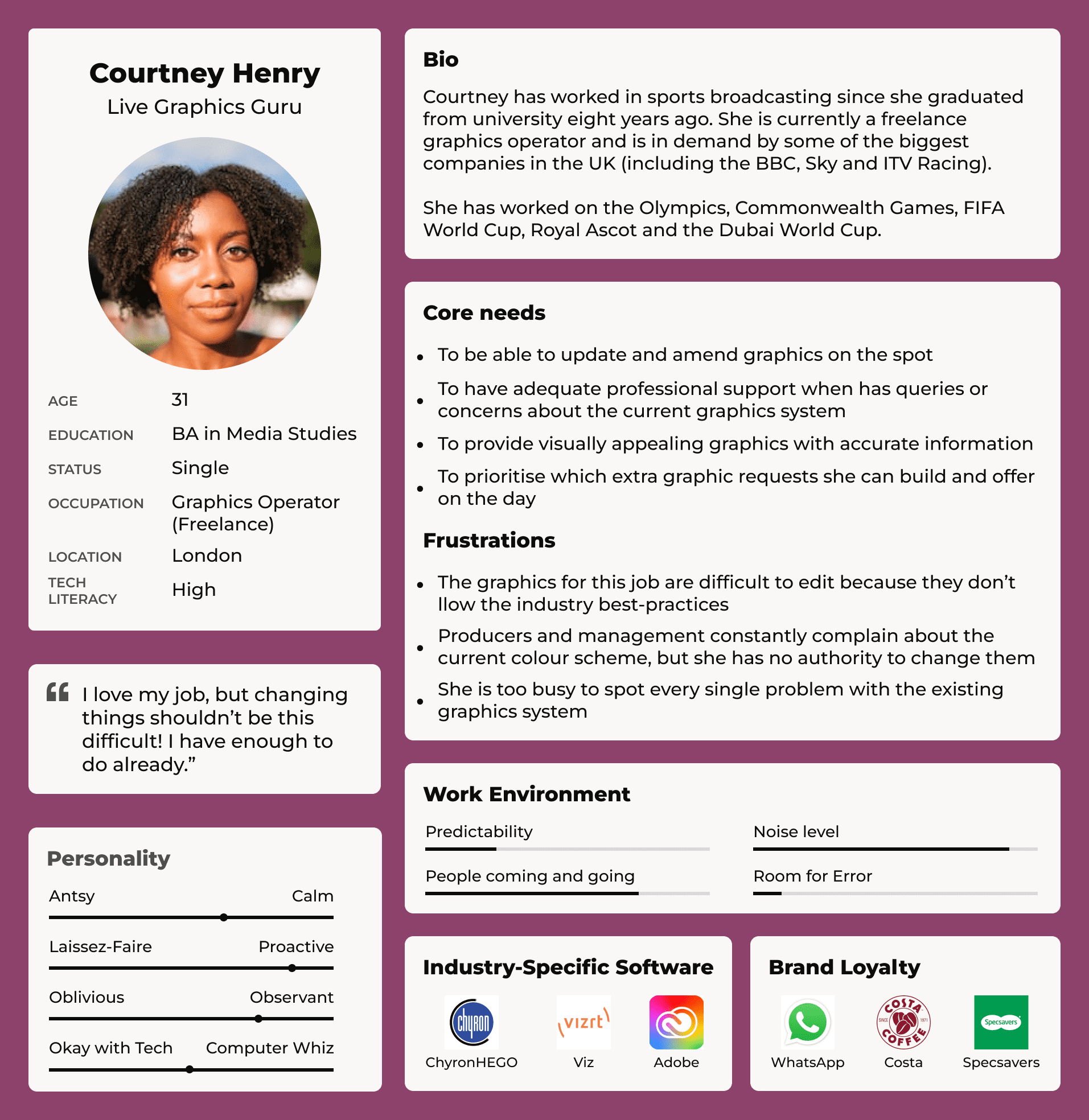
User Persona
Production Graphics Operator
I chose to focus on this persona because if the graphics operator cannot quickly access, edit or update the graphics, then none of the other users will achieve their needs.
The broadcast cannot occur, or at the very least, the output quality will not be ideal if the graphics operator cannot do their job.
This persona is an amalgamation of various graphics operators I’ve worked with through the years. Additionally, it illustrates the broadcast work environment.
Feature Prioritisation
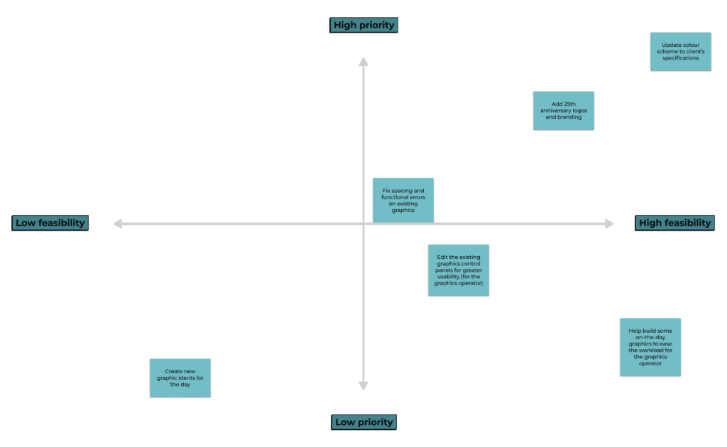
I collaborated with the producer to decide the MVP for the redesign.
We decided that the most important tasks would be to:
This was key for all stakeholders, first and foremost
To match the bespoke branding for the event’s anniversary
Fix anything with known design errors or inconsistencies
Including unique templates for the HD broadcast
Then I went even further and utilised a feature prioritisation matrix to visualise and decide how to spend my time most efficiently.
Process
The Artefact I had to begin the project...
Ideally, at this point, I would’ve been able to see our existing graphics.
But I still had no access to the template files—even a few days before the broadcast. Time was ticking, but I knew there had to be a workaround.
Critically, I had to figure out how to manage my time best because I knew my access to the Chyron would be limited. I wanted to create a system to hit the ground running when I finally did get access.
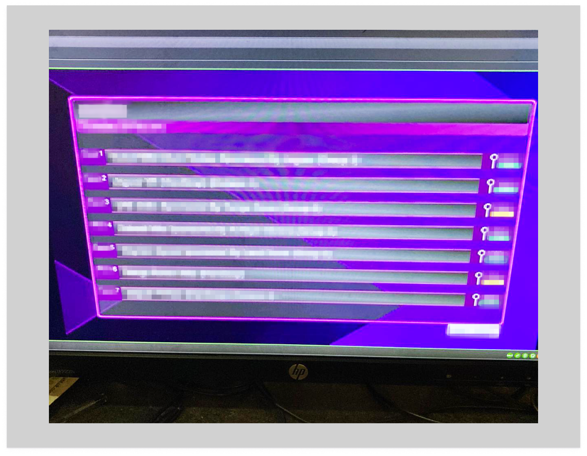
So, I asked the producer to send me photos of any graphics from our previous broadcasts.
I understood these photos—of the computer monitor, taken on an iPhone—weren’t ideal tools , especially for an HD broadcast. However, they allowed me to get started on the redesign, which was the main priority.
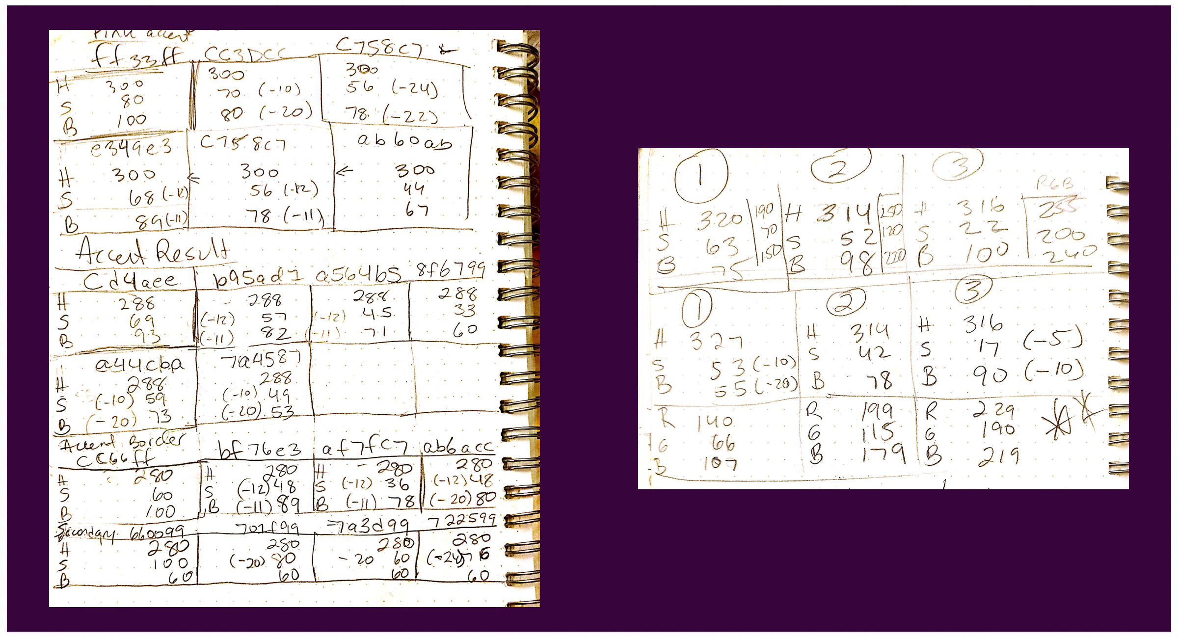
I used a colour picker on these photos to learn the colour palette. Then, I converted the RGB values to HSB and documented any consistencies in the values.
This process would make it easier to edit the colours later, even if I couldn’t initially find the exact match. It certainly wasn’t perfect, but it was a good start.
Refreshing the Design System
Ideating Scalable Colour Schemes
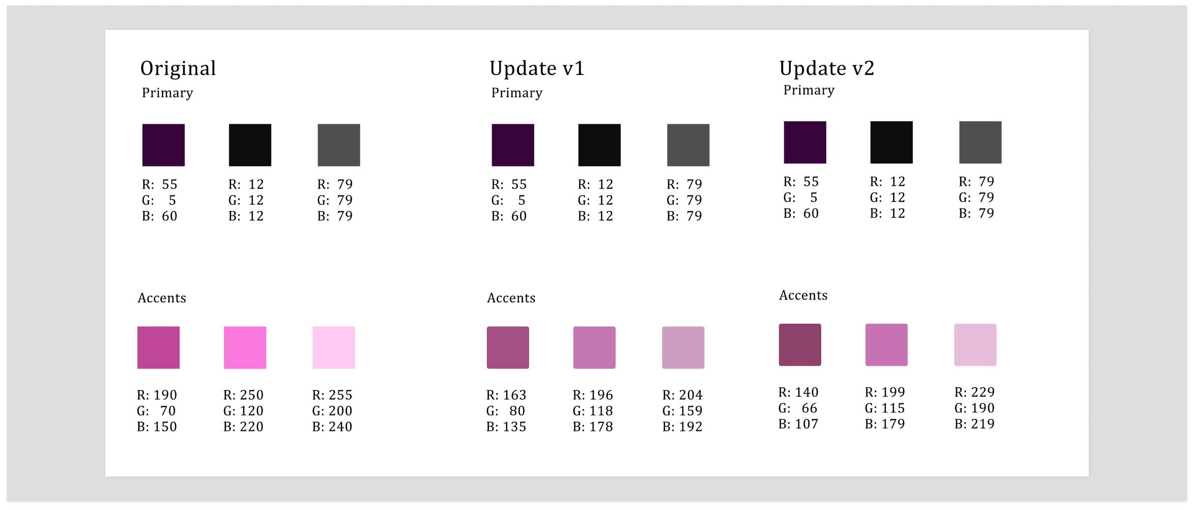
Creating a scalable and editable colour scheme was also important to me, so I experimented with different combinations of shade and brightness to develop several potential colour palettes for the producer to review. It was a bit of trial and error but worth it so I could iterate quickly.
I made sure to communicate my design choices clearly and concisely, because I knew the producer’s time was limited.
Once the producer approved the changes, and I finally had Chyron access, I began to update the broadcast graphics to align with the client’s requests.
This part is where the coffee, post-disco music and sheer force of will took over, and I would begin to see if my scalable design experiment would pay off.
Delivery
To ensure a smooth handover, I collaborated closely with the live graphics team for any elements that required iterating.
Once the graphics team was happy with my work, I gave them a complete handover document, including:
-
Style Guide & Detailed Notes
On how to optimise the updated graphic templates and 25th anniversary assets
-
Clear instructions
On how to update the colour scheme, graphics, and animations (in case of a system crash)
Outcomes & Lessons Learned
Most crucially:
I updated all 50+ graphics in time for the live broadcast, only a week after I received the brief.
But I got a lot more out of this project than the satisfaction of knowing a job was well-done.
I learned:
Not only did it help me convince stakeholders, but it also enabled me to scale the project effectively. This clarity proved valuable when unexpected issues arose, as the redesign was less straightforward than expected.
This project was my first experience with remote work, and I couldn’t help but wonder how different it would have been if we had done it in person.
With better tech at our disposal, it would have made every bit of the redesign easier. More time would have allowed for more back-and-forth with stakeholders to fine-tune the project.
However, this experience reinforced that:
We don’t always have ideal conditions in the ‘real world’, so we must find ways to work flexibly and efficiently within our given constraints.
By implementing a scalable, atomic-level design approach in this ‘real world’ setting, I was able to:
-
Prioritise
The most impactful use of my time
-
Fulfil
The client's brief to the best of my ability
-
Help
To make both the client and my organisation happy
I found this scalable method so valuable that I have since applied it to other broadcast and UX design projects.
Despite the incredibly tight deadline, overconsumption of caffeine and general lack of sleep, I found the experience incredibly rewarding.
